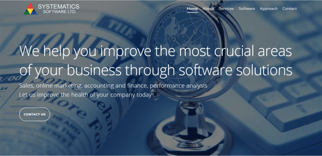
Web design in London is a key element in growing your London-based business online. If your products/services are like a castle, your website’s landing page is the entrance your consumers use to enter. You can spend hours working on your website design London, but if your landing page isn’t on-point, all of that time spent won’t really matter much.
Lots of companies don’t really cater to the importance of landing pages. They’re one of the most integral things when it comes to lead generation. It’s very easy to get caught up in the whirlwind of wordpress web design in London and focus on all the varying pages of your website, but without paying proper attention to your landing page, your website’s design will be futile. After all, the landing page is the door to your products and services at the end of the day.
So, if you want to know about some must have elements to design the perfect landing page, read on. Explosion Digital is here to you with all your digital marketing needs!
What Is A Landing Page?
For those of you that are confused and left out of context, don’t worry! Before we move onto the essential elements to build the perfect landing page, we’ll fill you in on what a landing page is exactly.
Landing pages are often referred to as “lead capturing pages”. They’re basically a page that a customer / consumer can “land” on, and they serve a focused purpose. A landing page is usually a standalone page but you can have more than one. It’s different from any other page on your website, and acts as a follow up to any promises your company has made. For example, if your business is about medical care, your landing page could be a call to action to book an appointment. In a nutshell, your landing page is what turns a website visitor into a customer. Landing pages let you make trades, give special offers, deals and information, and more, in exchange for contact details.
Must Have Elements for Building The Perfect Landing Page
Now that you’re in the know, we can move on to our tips to help you create the perfect landing page for your business. If you want to know how you can go about designing the perfect landing page, keep the following key elements in mind!
-
Never Use Your Homepage as a Landing Page
It’s very easy to get lost on a website’s homepage. Homepages normally have messaging features and contain all your other page links, which can make a visitor feel confused and lost. This is why your landing page should be separate and have clear calls to action regarding the products / services provided. This way, the visitor is clear on what needs to be done. A proper, separate landing page will ensure an increase in your conversion rates.
-
Always Include the Following Elements
Your landing page must have the following elements in order to be successful and clear:
- A headline and sub-headline (the latter is optional)
- A short description of products / services offered
- Include an image or short video in support
- Add elements of proof, like customer logos, badges, and testimonials (this is optional, but it makes your business look reputable and trustworthy)
- Most importantly, a form to capture information. If you can’t use a form on your landing page for some reason, use a big call to action button to help visitors reach the next step!
-
Keep the Extra Navigation At A Low
Your landing page is meant to have one purpose; to allow the website visitor to take a specific action. When a potential customer lands on the landing page, you want to keep them there till they perform the action needed. When you add main site navigation on your landing page, people are very likely to get distracted and start exploring, forgetting the initial point. So, make sure to limit the extra navigation on your landing page. Ideally, take it out altogether so you can turn your visitor into a customer with ease.
-
Be Clear and Simple / Straightforward
Information-stuffing is the death of a landing page. Your landing page must be straightforward and clear, so the visitor knows what to do next. When your landing page is overloaded with information, your visitor will be overwhelmed and confused. Try to limit the amount of images, media, and copy, and only add links that are absolutely necessary. Make sure the content on your landing page is properly and efficiently structured to give the visitor a smooth flow of action. The most important thing to keep in mind is that you MUST make your call to action as clear as possible, or you run the risk of not converting a visitor to a customer.
-
The Content Should Match Its Source
There are many ways a website visitor can reach your landing page. Whether they arrived because of a PPC ad, call to action from another source, or an email, you need to ensure that your messaging matches the whole conversion part. Otherwise, it’ll look broken up and unstructured, which is very unprofessional. You want to be taken seriously, at the end of the day. For example, if your PPC ad says something along the lines of “Book An Appointment With Us!”, your landing page needs to say the same thing, or something similar. This way, there’s a smooth flow of conversation. If there’s a disconnect in this stage, visitors may end up thinking they landed on the wrong page and click back. Your landing page needs to make your visitor feel like they’re “landed” on the right page.
-
Keep the Friction Low
Friction, like in the real world, is caused by objects on a page that prevent a person from taking needed action. It could occur due to the presence or even the lack of an object. Friction can include giving too much information / complexity, distracting animations, lack of proof, and much more. Your landing page needs to give your visitor a sense of confidence in their choice to give you their personal information.
To keep friction low, make your page simple. Make sure to use proof elements like testimonials, number of sales, security data (especially if you require a visitor to enter their credit card details), and also ensure that the flow of messaging matches throughout your conversion path.
-
VALUE is Important
When you offer something with value, you’ll be able to generate more leads that can lead to more sales. So, don’t make a landing pages for the following and things related:
- Downloading a fact sheet
- “Contact Us”
Do however make a landing pages for, and related to:
- Valuable whitepaper
- Valuable guides
-
Don’t Dilly Dally, Only Ask For What’s Needed
Web forms can be pretty confusing. There’s no true answer for how many form fields you may require. But, there’s a classic rule of thumb you can follow: only ask for what you/your sales team absolutely NEEDS. For example, if you don’t need their address, why ask for it? This will most likely raise suspicion in your visitor. So, only ask for what’s needed, and never ask for sensitive and confidential information. Also, try not to use words like “Submit” on your form button. It’s always best to make your visitor feel like they’re getting something, so use terms related to what they’re receiving instead of making it look like they’re giving you something instead. For example, terms like “Join our Mailing List”, “Download Now” and “Get Your Free Consultation” are pretty good at building trust and making visitors feel like they’re getting what they came for (which they actually are).
-
Need More Landing Pages? Then Make Them!
One landing pages isn’t enough if you keep having offers or new campaigns. So, every time you have a new offer or campaign, make a landing pages for it. With multiple landing pages, you’re given more opportunities to convert traffic to leads. The more the merrier!
-
Make You Landing Page(s) Shareable
Another great way to drive traffic that can be turned into leads and sales is to make your landing pages shareable. This is optional, of course, but it helps a great deal.
By adding social media sharing links and widgets, your visitors can share your content with their networks, and therefore broaden your network. This will give you more opportunities to convert leads.
See how our agency can drive massive amounts of traffic to your website
SEO :
Unlock massive amounts of SEO traffic see real results.
Content marketing :
Our team creates epic content that will get shared, get links, and attract traffic
Paid media :
Effective paid strategies with clear ROI.
Conclusion
Now that you know how to go about making the perfect landing page, you’ll be able to see a stark increase in leads and sales. If you want your website to turn into a lead generating machine, consider hiring a web design or wordpress web design agency in London. Explosion Digital does web design, SEO, and more, to give your business the best results-based services. If exploding into the digital world is what drives you, then Explosion Digital is your best friend!


